Mean
The MEAN chart is complicated, and it is no problem if you prefer to leave it to your doctor.
It is the sum of all your days in a single 24-hour period. You can therefore see in which range your scores were in every hour.
The bottom line is the lowest ('yellowest') score you have ever entered at that time, the top line the highest ('reddest') score ever at that time. So you have never been below or above those lines. The middle line is the 'median', which means the value of the middle score at that time. The 2 lines in between are the so-called 25th and 75th percentile. That sounds tricky, but means no more than: the lowest and highest quarter of your scores.
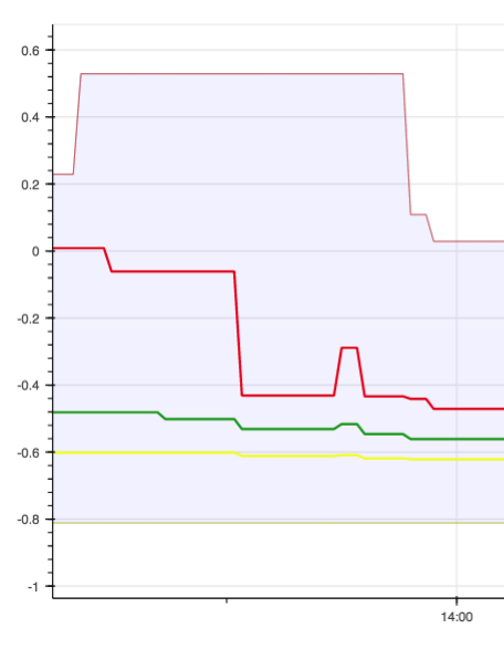
This is an example of someone taking too little levodopa in the morning between 6am and 10am, and too much after 7pm:
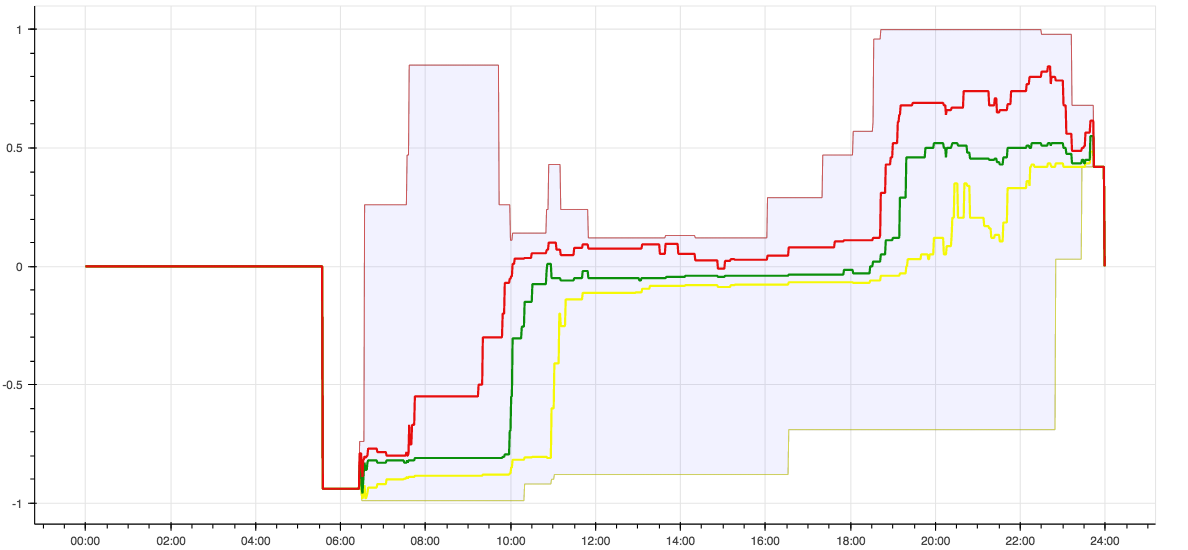
The flat part on the left concerns hours during which no recordings were made (sleep).
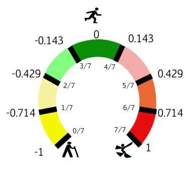
A technical extra: the y-axis shows values from -1 to +1, which according to this figure correspond to the place where you tapped on the rainbow on the watch: