Overview
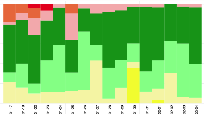
The chart OVERVIEW is the same as RATIOS, but every day is now side by side. The date is under each day. This way you can quickly see how your situation has changed over the course of a longer period of time, for example a month. Red is always on top in OVERVIEW, yellow at the bottom.