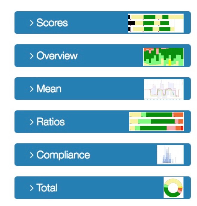
Charts
Charts show the course of your complaints, as you have recorded on the watch.
The color code is in the legend to the right of a card:
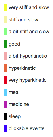
The color code is a representation per category, of your choice on the watch at the 'rainbow'.
To increase readability the colors have been adjusted:
will be shown as
The colors mean the same in all cards except in MEAN.
All charts (except medication report) show the same data, but in a different way.
TOTAL and MEAN show the entire chosen period in a graph. STANDARD, OVERVIEW and PERCENTAGES show data per day. In OVERVIEW, the days are arranged vertically, in STANDARD and PERCENTAGES horizontally.
OVERVIEW and PERCENTAGES are the same graphs, but tilted. In OVERVIEW it is easier to get a picture of changes over time, because the time is presented horizontally.
The 'SCORES' chart is the basis of your charts. It shows all the data you have recorded on the watch in the form of a diary. A line per day.
The date is to the left of each line.
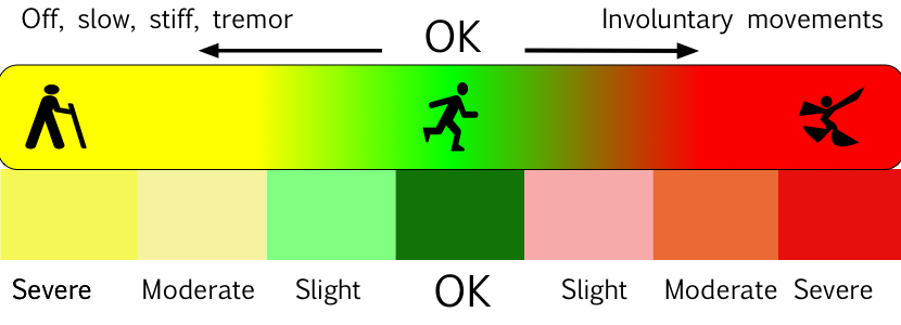
On that line, the colors indicate from hour to hour how your condition was. The greener the better, the more yellow the stiffer, the redder the more over-movable.

These last four legend colors represent these icons


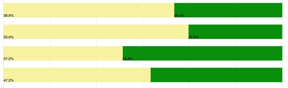
The chart 'RATIOS' also shows day by day, but blocks of the same color are grouped together.
Yellow is always on the left at RATIOS; red on the right. You can see which part of a day every color took.
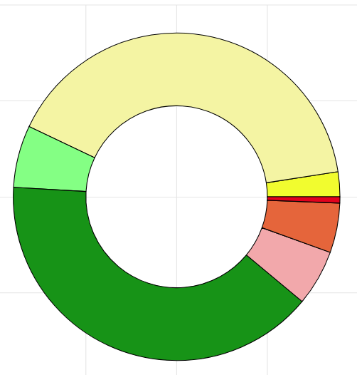
In this example of a day, in this case 22 January (the date is on the left of each bar), nearly 50% of the recorded time was green (good), 4% of the part of the day on which the registration is very dyskinetic (dark red ).

Note: the time plays no role in this card, other than in SCORES. If you want to know when you were 'yellow', you need the SCORES card. If you want to know how much you were 'yellow' then RATIOS or OVERVIEW is ideal.
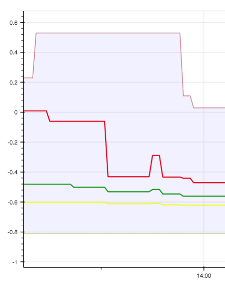
This is an example RATIOS of another person, of 4 days, each line is a day.
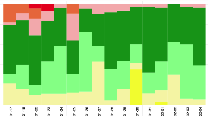
The chart OVERVIEW is the same as RATIOS, but every day is now side by side. The date is under each day. This way you can quickly see how your situation has changed over the course of a longer period of time, for example a month. Red is always on top in OVERVIEW, yellow at the bottom.
The TOTAL chart is simple: it shows a quick overview of the entire period you have chosen with the sliders.
The person in the example below was yellow a large part of the selected weeks, and a large part green.
The MEAN map is complicated, and it is no problem if you prefer to leave it to your doctor.
It is the sum of all your days, displayed in a single 24-hour period. So you can see per hour in which range your scores were.
The bottom line is the lowest ('yellowest') score you have recorded at that time, the top line the highest ('reddest') score ever at that time. You have never been below or above those lines. The middle line is the 'median', which means the score value in the middle, at that time. The 2 lines in between are the so-called 25th and 75th percentiles. That sounds difficult, but it is the lowest and highest quarter of your scores.
An example of someone who does not take enough levodopa in the morning between 6 and 10 am, and too much in the evening after 7 pm:
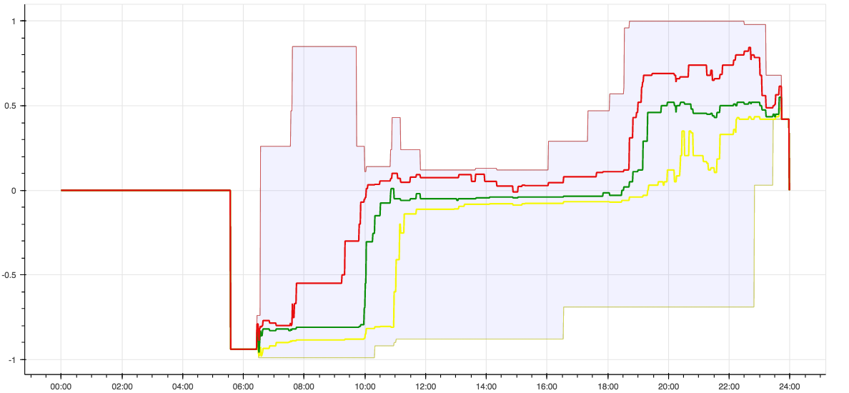
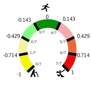
The flat part on the left concerns hours in which there is no registration (sleep). A technical issue: the y-axis shows values from -1 to +1, which correspond to the place where you tapped on the rainbow on the watch, according to this figure:

Charts show data from a start date to an end date.
Select them with a slider:

They need to be activated via APPLY!
Your selection remains active in other chart types.
You can change the display of all charts without risk. The option that you clicked will be marked with a blue line:
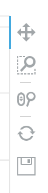
activate the cross to drag with mouse or fingers (touch screen)
activate the magnifying glass to zoom: select a block with the mouse, or with 2 fingers
activate mouse magnifying glass to zoom with the scroll button
click on the circle to return to initial values
click on the floppy to save as a figure (in folder 'downloads')

That places a picture of the card in the format .png in your downloads.
Charts give an idea of the course of your complaints, so that your doctor can adapt the treatment to your personal situation and needs.
In the next section you will find a detailed explanation of the possibilities.
